Thursday, November 21, 2013

Record Album Covers

 
Record Album Covers
The very front preview to an album. Provides a sense of what kind of material will be on the album just by the first image.
           
                                                             By: Perfectly Imperfect


This album shows through the cover that  they travel everywhere playing their tunes even though out the nights.


This cover provides an insight to the album by not only leading to one of their  songs, “Master of Puppets” but  gives you a visual image of what the album consists of.


This album gives an insight to what is not only in their album but their whole sound in a whole.


This album shows in the picture itself the vast movement so the title hear and now pertains greatly to it. The title and picture give and insight to the album

High Contrast


Team GuMM'D
High Contrast

 A high contrast, is a High Impact photograph that removes all middle tones, and only leaves the darkest masses and brightest highlights. In photography, it can only be manipulated using either in dark places or methods by hand. Gives the same feeling of watching a silent german expressionism movie, designed to be more dramatic

High Contrast Sky by jcredberry

by jcredberry from deviantart.com


This photo shows the dark figures and bright backgrounds some high contrast photos contain. But not all high contrast photos have to be this way. Mostly just the brighter onjects are enhanced from the contrast while the darker objects white levels are taken away.


by Rupert Vandervell from behance.net


This is an example of high contrast. Dark background to high light the man in the picture walking.


Another example of high-contrast, there is no median here. Just the brightest and darkest of colors.

Shot_1275943211

by Stephen Olmstead from dribbble.com

Impact- Pyschedelia


Team Impact

Psychedelic art is any kind of visual artwork inspired by psychedelic experiences induced by drugs such as LSD, mescaline, and psilocybin. The word "psychedelic" (coined by British psychologist Humphry Osmond) means "mind manifesting". By that definition all artistic efforts to depict the inner world of the psyche may be considered "psychedelic". In common parlance "Psychedelic Art" refers above all to the art movement of the late 1960s counterculture. Psychedelic visual arts were a counterpart to psychedelic rock music. Concert posters, album covers, lightshows, murals, comic books, underground newspapers and more reflected not only the kaleidoscopically swirling patterns of LSD hallucinations, but also revolutionary political, social and spiritual sentiments inspired by insights derived from these psychedelic states of consciousness.


Pyschedelia was a rebellious graphic language that communicated with a select community and for a brief time excluded all others. Pyschedelia is trippy to look at, it uses bright colors and sends messages to certain groups of people. Hippies loved this form of art.

This cat is made up of many colors causing an exotic look. It is also in space which shows the unreal side of the work. 

This girl is reaching out to the sun which is in a form of a human showing the hallucienogenic side of pyschedelia art.

http://www.deviantart.com/art/juxtaposition-57947650

http://www.deviantart.com/art/descending-upon-the-valley-104674397

Team Media Studies Street Slogans


This is more of an advertisement but the typography of it makes it seem like someone hand wrote it.

http://www.deviantart.com/art/the-art-of-being-real-24279141


Actually created by obey who made a career off of his street art. This slogan is sort of contradicting due to it actually being street art.

http://www.coroflot.com/MichelleLadin/Street-Art-Photography#a=2&k=street art


This street slogan seemed cool because just some random person had to have done it. they were hoping to create an impact somehow.

http://www.deviantart.com/art/Reclaim-The-Streets-2-36190949


Drb

This street slogan was painted by a graffiti artist to try and just get people to go with the flow. it is  effective because the thumbs up helps portray a good message.

http://www.blogger.com/blogger.g?blogID=6657034237932639526#editor/target=post;postID=6189659436055667222

Sexual Taboo Busting

Sexual Taboo Busting- is the immediate prohibition of a sexual behavior or appeal that is not widely acceptable within certain cultures. Specific behaviors are considered to be provocative and disconcerting within their societies.


    Obtained on behance by Serhiy Fedynyak
This pose shows sexual taboo that is not widely accepted.
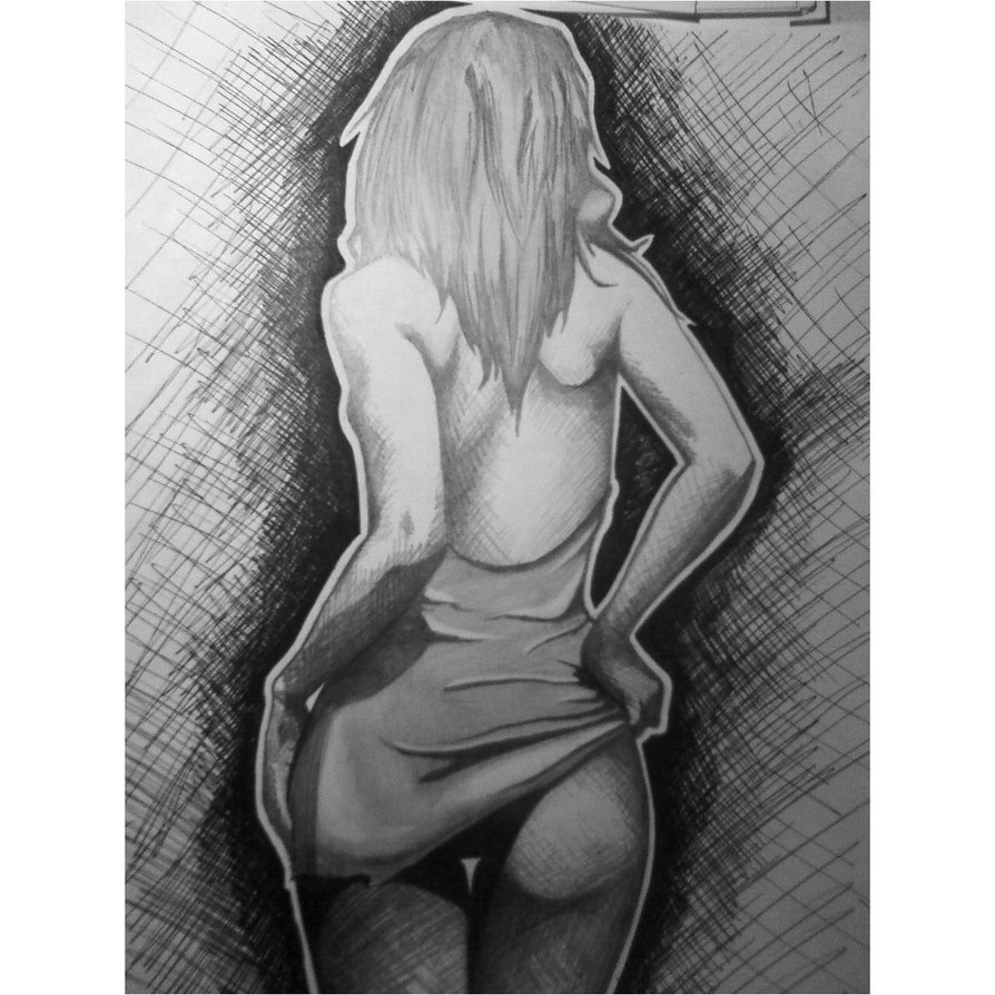
This drawing by GloomyDaze, called “The Sex,” found on deviantart.com shows sexual taboo busting. This woman is showing a sexual look. It may not be acceptable in all countries or cultures.


Ham, Chris. "Thought Is Free." Dribbble. N.p., 12 June 2013. Web. 19 Nov. 2013.
An image by an artist that basically has an open ended approach and left purposely for the viewers imagination.


This work was posted on Behance.net by Venc Design


This work demonstrates a sexual act to attract attention. the work makes most men be attracted to what is being said.
Sexual Taboo Busting- is the immediate prohibition of a sexual behavior or appeal that is not widely acceptable within certain cultures. Specific behaviors are considered to be provocative and disconcerting within their societies.


    Obtained on behance by Serhiy Fedynyak
This pose shows sexual taboo that is not widely accepted.

This drawing by GloomyDaze, called “The Sex,” found on deviantart.com shows sexual taboo busting. This woman is showing a sexual look. It may not be acceptable in all countries or cultures.


Ham, Chris. "Thought Is Free." Dribbble. N.p., 12 June 2013. Web. 19 Nov. 2013.
An image by an artist that basically has an open ended approach and left purposely for the viewers imagination.


This work was posted on Behance.net by Venc Design


This work demonstrates a sexual act to attract attention. the work makes most men be attracted to what is being said.

Sankofa - Culture Jamming

Culture jamming is defined as tactic used by many anti-consumerist social movements to disrupt or subvert media culture and its mainstream cultural institutions, including corporate advertising. It is basically ads being remade to make a fool of corporate industries.

This photo depicts the remake of a Coca Cola logo. It says "Enjoy Cavities." This exposes the company and impacts them in a negative way. Coca Cola is known for their sugary pop soft drinks. Rather than saying "Enjoy Coca-Cola" it says "Enjoy Cavities."

This piece of art shows a woman trapped in a traditional hijab. It looks as if she is in prison.There are bars covering her face and a lock. It shows that she has no say in this world and is locked in therefore, she cannot express herself. 

This photo mocks the company Dunkin' Donuts. This company is known for selling coffee and sugary foods which are very unhealthy to the human body. Originally this would say "Dunkin' Donuts" but now it says "Dunkin' Diabetes."

This image mocks the company that makes Viatmin Water. They are pretty straightforward and say that it isn't healthy for you, but it sure does taste good. 


Wednesday, November 20, 2013

Underground Comics by MACK

Underground Comics
are small press or self-published comic books which are often socially relevant or satirical in nature. They differ from mainstream comics in depicting content forbidden to mainstream publications by the Comics Code Authority, including explicit drug use, sexuality and violence.

Delta Motor Corp | Employee Communications

By: Theo Hawkins
This is an example of an Underground comic because it shows examples of things that have happened over the years, it includes things like importing goods and raising the price to talking about African Americans.

This is an example of an underground comic because it is showing a robbery which is against the law.


McJ^2 Pyschedelia


Pyschedelia is characterized by decorative typefaces, vibrating color, and vintage illustrations.  Pyschedelic art was a rebellious graphic language that communicated with a select community.  Each of the principal artists had a distinct personal style, yet the overall psychedelic visual language comprised an assortment of images in the public domain.


                                                                                                                                Juxtaposition 
                                                      By: xXjenjenXx
                                                                                                                         http://www.deviantart.com/art/juxtaposition-57947650
                                                                                                                         This caught our attention because of the vibrant color and personal style.


United States Of Pyschedelia

By KyleSpencer

 http://www.deviantart.com/art/United-States-Of-Pyschedelia-130142299

This followed the vibrant color and over all language of  a Pyschedelia.


       Heavensent

          By The-Breezeway-Barn

       http://www.deviantart.com/#/art/Heavensent-197854563?hf=1

       This one also has vibrant colors and its own personal style. 


Psychedelia for peace

By ruthey

 http://www.deviantart.com/art/psychedelia-for-peace-45537638

This does not have the vibrant colors but it still has the visual language of a psychedlia. 


Tuesday, November 19, 2013

IMPACT Less is more

Less is more - Sometimes you don't need a bunch of things to make your artwork look good, and in some cases less is in fact better than more.

 The picture shows the interior of a house, it doesn't need anything to look appealing, because it looks good with the bare minimum. (Meedatch Inthong)

 You don't need little designs to make a picture to stand out and grab your attention. Words can be powerful themselves like in this picture.

 You don't need a lot, you can see the features of his face with the little design that is created. (Chadwick Trammell)

 The book cover only says "Less is More," which gives it the mystery about what the book will be about.. and shows that not every title has to be over the top. (Sendpoints)

http://dribbble.com/shots/680982-Balotelli

http://www.behance.net/gallery/Less-is-More-Graphic-Design/9995689

http://www.deviantart.com/art/More-and-Less-216591396

http://www.coroflot.com/tinasignorita/Interior

Can/Am Split Fountain


http://behance.vo.llnwd.net/profiles2/120084/projects/347354/1200841258137371.jpghttp://behance.vo.llnwd.net/profiles2/120084/projects/347354/1200841258137371.jpg
Split Fountain: Putting more than one ink in a printing fountain to achieve special color affects


Josh & Alyssa’s wedding Save-the-Date postcard

By: Three Steps Ahead


We used this picture to show split fountain because you are able to see the different colors fading into each other. We enjoyed the fact that it was very playful and it was used to promote an event.


http://fc06.deviantart.net/fs70/f/2012/189/c/d/bird_of_paradise_by_hepcatnesmith-d56gdvy.jpg

                                                                                      Bird of Paradise

                                                                                 By: HepcatNesmith

             We used this picture to show split fountain because it was   different from most split fountains since the colors are going vertical and not horizontal and there is only two colors so it’s not as much as a dramatic color change as others usually fade out into different colors with the use of three or more colors. This print can be used for shirts or even print art.


Mattcate-preview Matt & Cate Invite Preview

by Adam Ramerth


We choose this as a sample of split fountain because your are able to see the different colors that are used to go into each other. We also liked that this image reminded use of a logo when you first look at it.

Nostalgia By Perfectly Imperfect


Nostalgia


Nostalgia can refer to a general interest in the past, their personalities, and events, especially the "good old days" from one's earlier life . It almost provides an emotional aspect towards the subject.


Nostalgia GDL©2009
This picture depicts nostalgia because it seems as she is looking at the photo the past go throughs her mind.


This depicts nostalgia as she pondering in her thoughts. The picture itself almost has a calming painful look towards it.


        This picture depicts a sense of  nostalgia because of time can be seen as being rather limited for some or some thinking back of better times which in turn can provide a n emotional aspect.


    Photos of children can be easily depicted towards nostalgia from the emotion that is set in with children in general. You can see the  sadness, joy. anger, any emotion a child provides fully.

Monday, November 18, 2013

Monoalphabets

In the 1920's the spiky black lettering that were traditionally used were really hard to use. Many people wanted to replace this lettering known as gothic or grotesque. But this became controversial.

Zut Font by brianskywalker

Thursday, November 14, 2013

SANKOFA: Film Title Sequences

Film title sequences is the method by which films or sometimes television shows present their title, production and cast members. Early title sequences were simple compared to those of today. They only consisted of the title card and nothing else. Beginning in the 1930s films began to use elaborate title sequences. As technology improved film studios began to add graphics into the title sequences.

One of the earliest films to begin using elaborate title sequences was this 1947 movie called Sinbad the Sailor. The title sequence has the letters of the opening credits form from colored water gushing into a fountain. it would be considered simple by today's standard but for its time it was amazing.

When compared to the title sequence of the movie above you can tell how far title sequences have come since they began to be incorporated in films.
http://www.youtube.com/watch?v=wvsQE3FRoLE
With more advanced technology title sequences like are more creative, elaborate and can set the tone for the movie.

 http://www.youtube.com/watch?v=-k2gsEI34CE
One of the more celebrated movie title sequences of all time, Seven set a precedent that still use to this day in which titles superimpose text over a black background. It continues to influence a host of designers.