Wednesday, February 20, 2013

Team Awesome- Calligrams

Calligrams are text as images. They use words, sentences, and paragraphs to represent ideas using text. In the following image the word bicycle is represented in different languages and forms  a picture of a bike.


The next image shows different types of music represented in text in the shape of headphones.


Tuesday, February 19, 2013

Botanical Geometry- Team 1

Botanical Geometry

Botanical geometry is a way that graphic artiest turned forms and patterns into different forms. Then around the 20th floral patters became a big thing. Around the 1900 Europe began to combine the flower patterns and the elements. Artiest around that area were all doing the flower, plant designs and made it big. 

this shows the flower design that the artiest all used. they zoomed up to show all the details
this picture shows a real leaf that all the parts that they used and could see. 

Loud Typography

"Making type speak" or Loud Typography is one of the oldest commercial posters. A posters purpose is to draw attention by screaming a message.

Aleksander Rodchenko's 1925 advertisment saying "Books in all branches of knowledge"
Its one of the most famous expamples of loud Typography beacuase of the triangular megaphone concept and the way the words shoot out to send the message.


WW2 had many examples when the allies won ww2 messages such as "VJ Day" or "WAR OVER" were screamed across pages in any language and typeface.

Asymmetric Typography- Team Krypotnite

Asymmetric Typography is the absence or abandon of the use of symmetrical structures in printing and designing. A radical set forth a concept that:"The purpose of the the new typograpgy is functionality."
In 1931, one of the Piet Zwart's asymmetric typographic exercises for the trio printing company in the The Hague. The random overprinting of modern and vintage letterforms prefirgures the deconstructive apporaches of the later decades.
In 1927, a film poster designed by Jan Tschichold for the Phoebus Palast, embodies all the geometrical characteristics of the New Typography of the 1920's.

Monday, February 18, 2013

Graphic Design Magazines- Chanel Flyers

Offset- By Schmidt On the cover of Buch und Werbekunst Magazine
Graphic Design Magazines

Graphic design evolved during the late nineteenth century and trade magazines were crucial to this business. Initially trade magazines established standards for printing and typesetting but businesses wanted more aesthetically pleasing layouts, therefor magazine editors were forced to come up with new advances in design.   An example of these magazines would be the Berlin-based called Das Plakat (The poster) that focused on conventional and avant-garde sensibilities and was founded in 1910 by Hans Josef Sachs.  In 1921 commercial artist and typographers were influenced by futurism, De Stijl, Constructivism, and Dada; Artists began to apply these methods to their commercial work.  Many German printing and graphic industries had been offered a full dose of the new type and layout known as New Typography.  The roles of these magazines was to record, observe, and report on the field, but some also excited the passions of designers and altered the popular perception in styles of design.  After World War II the design Graphis was the most significant graphic design clarion.  It was Zurich-based, multilingual international magazine founded in 1946.  These international focused magazines are not trade oriented but rather cultural-concerned focusing on the design and visual culture. 


Campo Grafico
Dot Dot Dot 7 Magazine

Red with Black (Team Ice)

In 1919 El Lissitzky captured the first red with black poster. He carefully balanced the perfect layout. It turned out to be an agressive duo.
The red stood for the revolutionary forces, and the black represented the darkness surrounding the white monarchists. To exemplify the tension he used geometric shapes. Red and black is used against each other to show difference in opinion. This style was often used for propoganda by the Soviets. The red and black demonstrated their pugnacious nature and versitality.
Sadly, during the 1930's and 40's red and black was used to brand totalitarian regimes, such as portraits of lenin and Nazis flags.

Supergraphics - The Dream Team


                                                                    Super Graphics
                               Super graphics was started in the late 1960's inspired by Op art.
Op art :Optical art is a method of painting concerning the interaction between illusion and picture plane, between understanding and seeing. Op art works are abstract, with many of the better known pieces made in red and yellow . When the viewer looks at them, the impression is given of movement, hidden images, flashing and vibration, patterns, or alternatively, of swelling or warping.
Supergraphics
Big graphics that are applied with vibrant colors, usually in geometric shapes, over walls or floors and ceilings to make the illusion of altered space.


Wednesday, February 13, 2013

Team Ice- Paper Cutouts


Paper Cutouts
 
Paper cutouts are a form of Modernist art resemblant of childhood artwork. Artists such as Henri Matisse would cut and paste rough imagestogether creating collages like the one below.
 
 
This is a piece titled "Circus" and is the book Jazz, by Henri Matisse. Below is a collage made by a 7 year old that learned about Henri Matisse in school and used construction paper to create her own collage.


Tuesday, February 12, 2013

Team Kryptonite- Primitive Figuration

The use of primitive figuration is the simplification of the body, head, arms, legs and facial features. Primitive figuration are the reduction of realistic forms into raw, abstract, interpretive sharp. It stems from primitive African art, which was introduced to the west through German Expressionist graphics in 1905.

 
A raw brushstroke, emphasizing, the over sized red hand as a symbol of welcome- "hello neighbor!"

This poster was influenced by the outline drawn by the police to indicate the position of a murder victim.

Monday, February 11, 2013

Swashes on Caps By Pandora

Adding a flourish to an uppercase letterform is not unlike pinning a silk flower to the lapel of a gray flower suit. It can look gaudy but it is exactly what type designers have done since the end of the nineteenth century.

Swashed capital letters, so the reasoning went, would be useful to mark the begining of a sentence or paragraph, emphasize the first letter of a name, or higlight the title of a book.

 
In the eighteenth century, swashes were also added to some lowercase letterforms to confer a distinctive  calligraphic edge to announcements and calling cards.
Phil Barnes's cover in 2004 for a book of meditations by Marcus Aurelius used swashed letters.

The Square Format. TEAM 1

The Square Format

 
The square format was something they used back in the old days in art magazines. One major magazine that used it was Ver Sacrum. They used the square format because the design looked better. Another magazine Wendingen in the netherland used the format too and made the best cover designs in that time. alot of magazines used them because it caught peoples keys more then other pictures. Alot of graphic design people started following this trend too.
 

This is an example of square format. They crop some of the picture, so that you can fouces on the main part. It brings the color out more and the buliding get brigter.
This is also a exmaple of square format. This shows one little flower and it brings it at a angle so you can see the flower more. The colors come out more after the did the square format. it makes you fouces on the main part.

Text as Images- Chanel Flyers

Text as Images
Irredentismo- Fillipo Marinetti
Texts as images came into play in the beginning of the 20th century by an Italian futurist Fillipo Marinetti.  In his composition in 1912 he transformed typography into a weapon against bourgeois values. Other artists started to follow his tradition by using text as paintings, designs, photographs, etc.  Some performers also use this to form visual protests.  


ImaginGraphic


The Object Poster 


  •    The "Sachplakat" or an object poster oringinated in Germany in the nineteenth centuary,and took the advertising and design world by storm. "The simpler image, the more powerful the communication." It was found by Lucian Bernhard, an eighteen year old german cartoonist, who in 1906, entered a poster competition sponsered by Berlin's Preister match company.


  •   What it means is that one image could make about a thousand words. It's a crown jewel in the crown of a large stylistic movement called "Plakatstil", or Poster Style

Propaganda - Dream Team


Propaganda : Information, especially of a biased or misleading nature, used to promote or publicize a particular political cause or point of view.


                                The dissemination of such information as a political strategy.


Team Awesome : Visual Puns


Visual puns:
A visual pun is an image with two or more meanings, once combined they have one message. Graphic design could not exist without these. You can transform a picture or just an image to make it have different meanings. This forces the viewer to read more into the image to see what it is saying and to get the message out of it. Not all puns are humorous though and can’t have two meanings. Some puns use pictures, letters, and or words.


This shows eggs being called more than just eggs. You can have an egg regular, or many different ways. The picture on the left is not what they mean when the say deviled eggs, it has more then one meaning. Obviously the picture on the left is not what they look like the picture on the right is what actual deviled eggs look like.

Team Awesome Ornamentation

Ornamentation is adding things to something to decorate it or to make it more elaborate. The article describes how euro paper currency looks better than the American dollar because even though the American dollar shows more patriotism, the euro paper currency is more appealing to look at.


Ornamentation in general make things more appealing to look at. This can be used not only just for making things look good but can also be used to sell things. Most products are guilty of using ornamentation to sell their products.


Mountain Dew for example uses ornamentation by using cool graphics on their bottle and also changing up the color of their drink to a bright green that no other soda product has. By doing this it makes their product look more appealing.


The picture above is a book cover that uses ornamentation to pull you and try to get you to want to read it by using an eye catching picture and bright colors.

Wednesday, February 6, 2013

Monumental Images - ImaginGraphic

Monumental images has always been a way for perpetuating myths and building heroes, that people look up for the to. The Colossus of Rhodes is a image of the Greek god Helios.This a for the gargantuan advertising display. It celebrates Rhode's victory in 305 B.C.E.


Most people understood the larger-than-life scale that was being shown in monumental images. Rulers were always human in reality, but they can tower high above multitudes.  For example Benito Mussolini had a billboard with him sculpted in the building. This showed how power and graphic monumentalism played a role together.


The world awes at the sense of something being bigger than it should be. When you increase the size of something it stands out, no matter what the message or image was. The world bows to monumental images. 

Tuesday, February 5, 2013

Team Ice Female Archetypes


Female Archetypes

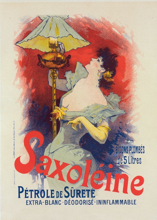
The first accredited female archetype was created by Jules Cheret at the end of the 19th century, she was a free-spirited Parisian girl with a hourglass figure. She was used as advertisements for nightclubs, theatrical productions, horse races, cabaret shows, even alcohol, and cosmetics. 

Females are portrayed with expressive hand gestures and a relaxed upper body. They were seen as girls with a kind of self-confidence that would eventually be associated with the liberation of women.

By the end of the 1930s Coca-Cola perfected the genre with seductive housewives. 

Not until 1941 the term 'pinup' was coined to describe the way young males liked to hangup and display the glamorous images of the girls. "Rosie the Riveter," was a popular pinup of this time although it was not a classic beauty.

Eventually photography replaced the illustrations and portraits of Marilyn Monroe, Sophia Loren, and Brigitte Bardot where making headlines in the 1950s.

Entrepreneurship- Team 1

 
An entrepreneur is someone who takes the risk to start a business venture. In this picture the man is looking into the globe that says future and it looks like the future will be bright for him if he takes the risk to start a business.

 
In this picture there are many people that are trying to start a business metaphorically because of the finish line. The one man in red is the lone person out of all these individuals that successfully started their own business. 

Color Blocks- Team Kryptonite


Color-blocking was a style that acquired a life of its own in the United States in the 1930s.  Poster artist all over the world kept trying to bring back the "Japonisme" trend which was a form of art in Japan.


This piece of art was created by Toulouse-Lautrec and is one of the better pieces showing the technique of color-blocking that is called the ukiyo-e printing technique in Japan from the seventeenth century onward.


This piece of art was created by Swiss art director Stephan Bundi in 2007.  He says it illustrates how powerful the artwork is with a solid orange background, with the sharp white cut out of a mans head which realistic fingers that are representing horns. 


Monday, February 4, 2013

Decoritive Logotypes By Pandora

"If in the business of communicaions, image is king, the essence of this image, the logo, is ithe jewel in its crown." ~Paul Rand
 
Decorative logos are the crowning jewel of the companies they represent. Geneal Electric's logo is imbued with restrained Art Nouveau ornamentation 
 
GE Logo
 
These logos add a regal feel to the company's look. Coca-Cola's swirl of Spencerian script is a decorative tendacies that reflect the time period of the origins of the product.
Coca-Cola Logo


Decotive logos took a down turn for a while and modern design took over. Today the freedom of design came back and more designs have gotten more creative and more elaborate.