Saturday, September 28, 2013

Sankofa - Funny Faces

Funny Faces

When we think of something funny it amuses us. Our topic was "Funny Faces." Something that is funny can be odd or strange. It is something different and it usually makes us laugh. This picture is odd and strange in many ways. The character has a goofy look on his face. His eyes are crossed, has a funny smile, and a funny chin. He looks like a character you would usually see on a television cartoon show. Everything about his face is odd. He doesn't look like a normal person. 


This picture shows a man who has the face of a butt. He has facial hair and is wearing a suit. He seems classy and high class but once you look at his face your perception of him changes. 


This character appears to be smiling or laughing. His face is somewhat disfigured. He has a large nose and a weird looking smile. He looks similar to Sloth from The Goonies.


This character has a cube shaped head. His head looks like an app for the iPhone. He has weird looking ears, big teeth, and a large jaw. 


Thursday, September 26, 2013

Red With Black


In the western world the color red is usually associated with violence and all things intense and passionate. Red can also be seen as a way of welcoming people in other cultures. On the other hand black is universally associated with death and anarchy, but in earlier centuries it was seen as royal wealth. When combined together red with black can be seen as bringing aggression and fear.


bulls.jpg

     
while most people would not associate this with death it did strike fear to many people in the basketball ball world during the 1990's. The Chicago Bulls logo was able to bring fear to opponents and also passion amongst its fans when the team dominated during that time.


        screen_shot_2011-09-19_at_11.31.19_am.png
The sign above uses red with black as way of getting out a message. having the color red attracts the attention of the viewer. Having the letters in black warns the viewer of impending danger since people are programmed to think black is a sign of danger or something worse.


black_rose_and_red_star_by_laghing_rabt-d4zgx51.png
The black rose is sometimes used to refer to a persons's dark soul and at times used by people in anarchist movement. The red star usually stands for socialism which many in western may find aggressive. 


Blake Marte, Team Impact - Botanical Geometry


Botanical Geometry is a way that graphic artists turned forms and patterns into different forms. botanical means biology of the plant or study of the plants, while geography is focused on mathematics and its objects and shapes.


                              In this image, the leaves form a circular pattern. Each individual
leaf has the same distance apart from each other which gives off a geometric pattern.

 This Banana Leaf wors as a mirror from both sides.
It has lines of simitry which patters the entire leaf.
If it were to be folded in half down its stalk, the patterns would align perfectly.

This illustration is symmetrical just like the banana leaf.
The difference between this photo and the banana leaf is that 
this photo is symmetrical on all four sides rather than just two.


GuMM'd-Supergraphics

      SUPERGRAPHICS

      The term supergraphics was established in the 1960's. Supergraphics are huge arrays of images on walls, buildings, or large objects. They are designed to make a point by confusing the eye. They create something that stands out so strongly in size, color, and/or angles. It can be known  as "Gigantic graphic art". They can make permanent art forms in buildings such as floors, walls, and ceilings.


           Not all supergraphics are made for use in gigantic objects or architecture. This painting for example, it was made by WierdAlbatross called "Duality". It may be traditional art and very surreal, but he expresses on a multicultural city, wonders of technology, animals dying out, and a tall, thin and beautiful and cocaine addicted city woman.
                                                                                                      Found by Kristian Fino on Deviantart
 
This is an example of a supergraphic. An effective use of wall space for advertising, this one's a little scary though.
                                                                                                      Found by Zachary Pauling on coroflot


This picture shows the very elements supergraphics represent. It contains vibrant colors mixed with the geometric shapes to give the illusion that the room is bigger than it actually is. Supergraphics are designed to usually be put onto walls, ceilings, and floors to create this element of a cavernous room.
                                                                                                                       Found by David Simmons


Introduction by:
Charles Harageones and Kristian Fino
 
Images and description by:
Kristian Fino, Zachary Pauling, and David Simmons
 
Resources
100 Ideas That Changed Graphic Design


Ransom Notes Team Mystery

       RaNsOM NoTe'S
A jumbled type or ransom-note school of graphic design gained its name from the clichéd style- cutout letters intended to hide the identity of the sender. It has roots in the late nineteenth century, when common job printers carelessly mixed disparate wood and metal type styles together on the same page, resulting in a cacophony of typographic noise.


This image is of a man over a background of clouds. Within this image is a message saying "Leave a bag of Fritos at the door at 8:30 p.s. bring dip." This image doesn't tell you who the sender is but they leave a message of what they want, and if you don't bring it, it kind of feels like a threat.
 
 
This seems to have a collage of different things in the background and kind of has a puzzle look to it. You have to figure out what it says, the words are kind of scattered. It reads "I stole your acid I demand shiny kittens and fluffy clouds".
 
 
This ransom note uses newspapers behind it to give it a graphic design feel, the black definitely brings out the ransom letters. This one reads " I have always believe writing ads is the 2nd most profitable form of writing the first.."


Botanical Geometry


                                  Botanical Geometry

Is the idea that one can turn natural organic forms into highly stylized patterns. Around 1900, all over Europe, graphic artists combined curvilinear floral motifs with rectilinear elements as a reaction against the pervasive sentimentality and fastidious elegance of Art Nouveau.


http://www.deviantart.com/art/ARABIC-CHEST-1-COVER-300281212
We chose these two images from deviantart.com because of the different curves and twists that mesh with flowers, to form what we think Botanical Geometry would look like

Asymmetrical Typography by MACK

Asymmetrical Typography
style of typography that avoids symmetry when printed or digitally displayed in order to communicate strength and energy in the writing.


"Lifted Research Group" By: Daniel Coleman
http://www.coroflot.com/projects
This is an example of asymmetrical typography because they letters are not aligned and the L for all of them are combined into one.

Naturalia
"Naturalia" By: Carlos Fabián Camargo G
http://www.behance.net/search?search=Asymmetrical+Typography
This example shows asymmetrical typography by the letters being many different sizes. Some of the letters are capitalized while others are lower cased."Water Efficient Brochure"
By: Paul Humphris
http://www.behance.net/gallery/Water-Efficient-Brochure/811530
 This piece is an example of Asymmetrical Typogorphy because instead of having the words "water" and "efficient" together, the creator broke them apart to give the words more of an appealing look.


"Positive Thoughts Beyond the Clouds"
By: Cyprus
http://www.behance.net/gallery/Positive-Poster-1/1747558

This example gives off a happy energy with the bright and colorful text. Combine that with the positive quote that is on the example and the background of the sky, this piece is has a lot of positive energy making it a type of asymmetrical typography.


Manifesto

What Is Manifesto?
Manifesto is a written statement that describes the policies, goals, and opinions of a person or group.

Its almost like a Freedom of Speech kind of thing. Once you make your creation, whether it be in words or a picture, the way it is presented can impact on people in many ways some the same and some different.
This is probably the most well known manifesto. It’s what started the process of this country being what it is today.


This one is how a business might use a manifesto, putting together all what they think their ideal and strong points are out for all to see.


By:Samax
This is a powerful image announcing the, what the author thinks, death of the “starving artist.”
By:Spurs83

This is another one like the above but in reference to sarcasm and how it’s used.


Wednesday, September 25, 2013

Asymmetric Typography Team 518

Team 518: Asymmetric Typography
As the definition states that Asymmetric Typography is style of typography that avoids symmetry when printed or digitally displayed in order to communicate strength and energy in the writing.
This image was posted on deviantart by techitch34. The image displays many letters that are asymmetrical composition and sans serif. Each part of this image is created to give the feeling of 'frustration'.


This is an example of an application of an asymmetric typography by Elisabeth Lundin from Stockholm, Sweden. “The task of course, was to learn and understand asymmetric typography, and apply it into a "redesign" of the recently released book about amazing multi-artist Anders Krisár.“


http://www.coroflot.com/Marlee3390/Poster-Redesign


This poster found on coroflot.com and designed by Marlee Youngkin shows asymmetric typography because it is not designed with an average poster format. Instead of typical who, what, where, when questions on a boring poster, the designer scatters them in a downwards diagonal format. This catches design students’ eyes, and lets them know information for an upcoming contest.


Image by FontFont-Berlin, Germany @ http://www.behance.net/gallery/FF-Bau/147468

This type of writing is called Helvetica. It has a reputation for being the world's most popular Roman typeface for over four decades. The original was Drawn by Max Medinger and introduced under the name Neue Haas Grotesk in 1957. This style of writing uses asymmetrical typography to grasp the readers attention.

Loud Typography McJ^2

Loud typography is as old as the earliest commercial poster-since the goal of the poster has always been to draw attention to itself by screaming a message as the size of the paper they print on.

 
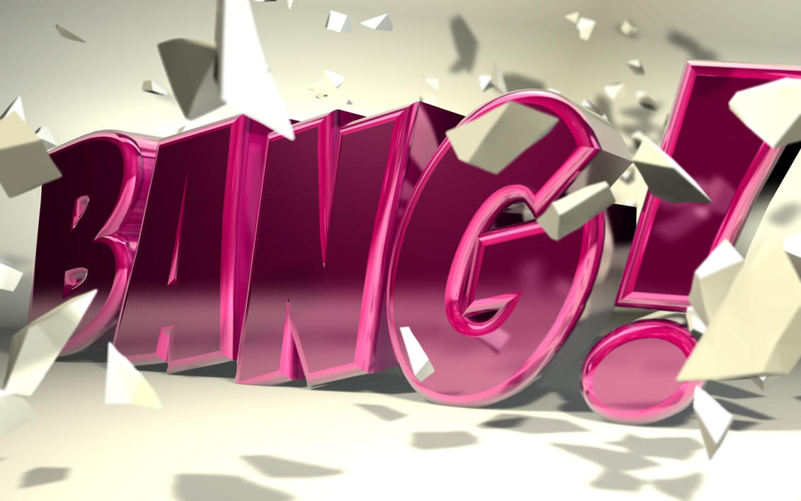
"BANG!" Deviantart       By: b4ddy      http://www.deviantart.com/art/C4D-quot-Bang-quot-Typography-152271000

This image is an example of Loud Typography because the word BANG! is as large as the paper it is printed on. It screams at you, when you first look at it your eyes are caught by the capital letters, the eye popping catch of the purple color and the pieces of debris scattered throughout the picture.
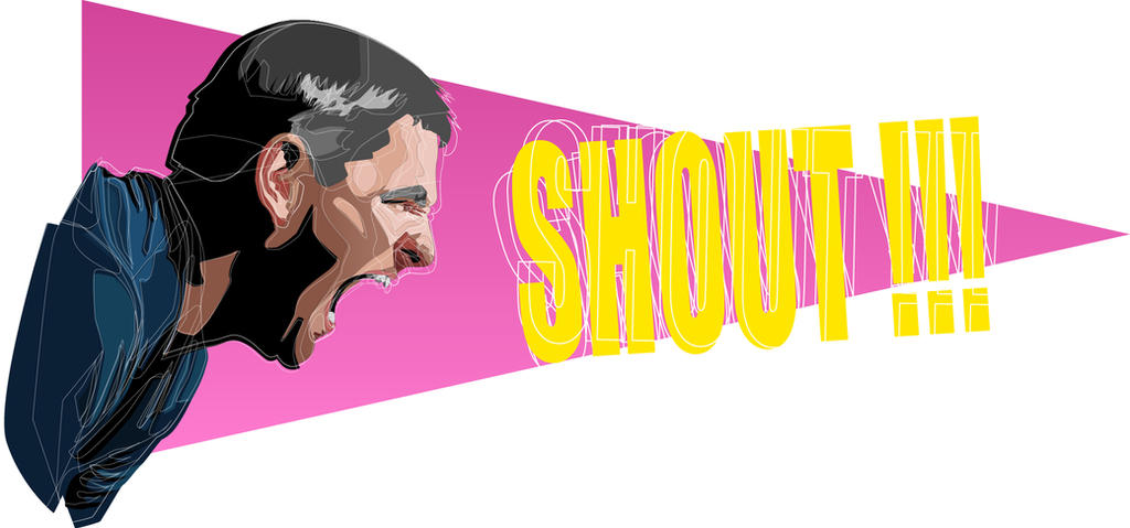
"SHOUT!!" Deviantart      By: Mestav      http://www.deviantart.com/art/SHOUT-353322777 
"LOUD AND PROUD" By: Aruetter   Deviantart    http://www.deviantart.com/?q=loud+typography&offset=120


The mega-phone is a device to make what you say louder and for more people to hear you.
She is yelling in the mega-phone "LOUD AND PROUD" and the actual words are large, which seems like they are screaming them too you without actually hearing the words.

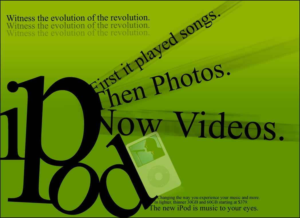
"IPOD"  Deviantart     By: curicalbiitch     http://www.deviantart.com/art/ipod-typography-29944393


Its an advertisement for IPods, the "IPod" is the biggest word on the page making it the first part of the advertisement you see. It screams at you, buy an Ipod! It's getting bigger and better with every new edition that is coming out. 

Sunday, September 22, 2013

Diesel Supergraphics


Supergraphics is billboard-sized graphic shapes usually of bright color and simple design.

zonenkinder_art_collective_installation_9_by_cmdpirxii-d6ncgnw.jpg

This photo was posted by Cmdpirxll on Deviantart. This picture is a 3-D of someones pants. It shows a man and women reaching into them as if its right in front of them. The main focus in this picture would be the pants hanging in the air.


super_vending_by_tka4ev-d5qukmw.jpg

 This photo was posted by Tka4ev on Devianart. It shows to people moving items in to a vending machine. this picture also has some type of 3-D effect to it. It has its main focus on the works and does not have to many colors in the picture either.


supergraphics_by_tka4ev-d5qunet.jpg


This was posted by Tka4ev from Deviantart. In this picture it shows the corner of someones room. This picture give you the illusion that the drawings are coming of the wall.


5902935.jpg


This was posted from behance. This photo shows someone climbing up a ladder. Its shows a lot of things going on around the ladder but it seems like the person main focus is to make it to the top of the ladder.


Thursday, September 19, 2013

Propaganda - Sankofa


 Propaganda is a form of communication aimed towards influencing the attitude of the community toward some cause or position by presenting only one side of an argument. Propaganda statements may be partly false and partly true.


  This is a good example of propaganda because it shows how the government influenced the nation to nuke a place.  They say "let's nuke EM first " to give the community a scare and a reason to take there side and agree to go along with this plan.  They use a poster because pictures connect with the public better than a speech.  The words put the public in a situation where it's do or die.


      This is a good example of propaganda because it shows how the government wants to control use.  They want us to let them run our lives hints the quote "let us think for you".  It's also means they they believe that we can't think for ourself and they should make all important decisions for us.  It's relates to slavery in a way because, white men wanted the black people to let them make decisions for them.


Impact/ The Object Poster

THE OBJECT POSTER ..


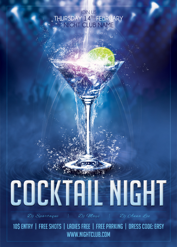
this is an object poster of an invitation to a party.
the theme of the picture is cocktail night, you can tell by the cocktail being
the main object of the poster that there will be drinking held at a club or
party like environment. The martini glass is the only object in the picture but
symbolizes what to expect at the event. Its simple but has a clear message.

http://sluapdesign.deviantart.com/art/01-Cocktail-Night-Poster-Template-350095877 by sluapdesign


Paint

In this image there is a brush dipped in green paint.
With only just the brush in the picture, you can assume
that the surface will be painted green because there is already
green paint on the brush to be ready to use.
this is a very simple object poster but the objective of an
object poster is to communicate more with less.

http://dribbble.com/shots/993056-Paintbrush?list=searches&tag=object by Vasudha Chandak


This is a object poster of a made-up movie
the objective from the creator was to take the two
plots of the movie and put it together with
two object representations. The bomb behind the clock
in the poster shows that there is a limited amount of time
before a disaster occurs. The two objects compliment eachother
well informing the audience on what the movie is about.

http://www.behance.net/gallery/Object-Film-Poster/7990465 by Ryan Nguyen


Object posters are used for any situation and can contain
any information. This object poster has images of chained
wedding rings. The chain between the wedding rings symbolize
the commitment behind marriage. This object poster kind of represents
a public announcement. supporting your human rights to marriage for
partners who are ready for their new responsibility as soulmates.

http://www.behance.net/gallery/Declaration-of-Human-Rights-Poster/7055411 by Ty Best