Team 518: Asymmetric Typography
As the definition states that Asymmetric Typography is style of typography that avoids symmetry when printed or digitally displayed in order to communicate strength and energy in the writing.
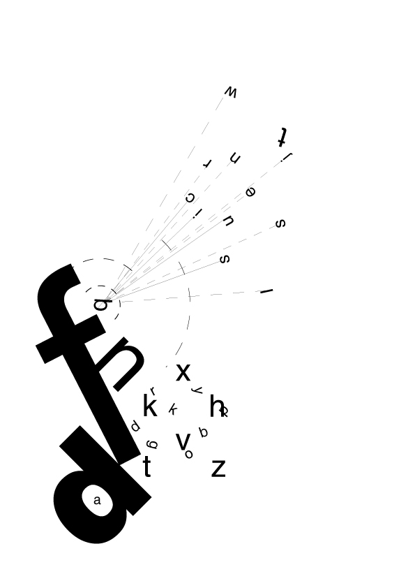
This image was posted on deviantart by techitch34. The image displays many letters that are asymmetrical composition and sans serif. Each part of this image is created to give the feeling of 'frustration'.
This is an example of an application of an asymmetric typography by Elisabeth Lundin from Stockholm, Sweden. “The task of course, was to learn and understand asymmetric typography, and apply it into a "redesign" of the recently released book about amazing multi-artist Anders Krisár.“
http://www.coroflot.com/Marlee3390/Poster-Redesign
This poster found on coroflot.com and designed by Marlee Youngkin shows asymmetric typography because it is not designed with an average poster format. Instead of typical who, what, where, when questions on a boring poster, the designer scatters them in a downwards diagonal format. This catches design students’ eyes, and lets them know information for an upcoming contest.
Image by FontFont-Berlin, Germany @ http://www.behance.net/gallery/FF-Bau/147468
This type of writing is called Helvetica. It has a reputation for being the world's most popular Roman typeface for over four decades. The original was Drawn by Max Medinger and introduced under the name Neue Haas Grotesk in 1957. This style of writing uses asymmetrical typography to grasp the readers attention.
No comments:
Post a Comment