Friday, September 28, 2012
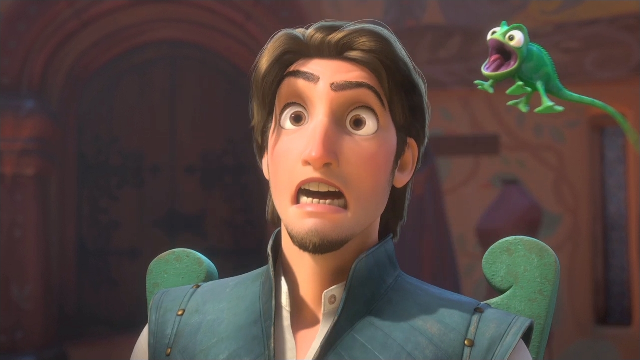
Funny Faces
Thursday, September 27, 2012
Disco Ninjas
http://www.serengetibook.com/final-dust-jacket/
Dust Jackets is a removable paper cover used to protect a book from dirt or damage, this is shown in the picture above
http://www.roosbros.com/?paged=10
Found typography: letterforms and numerals that are found in the natural and the manmade environment, like in the picture above shows letters formed in nature by trees
Thursday, September 20, 2012
Manifestos

Everyone has their own individual likes, dislikes, habits, and hobbies and no one can ever copy those characteristics. Everyone should accept who they are and make a positive contribution to life because we all are here for a reason.
Reference:
http://blog.betterfly.com/2012/03/16/top-10-motivational-manifestos-4611
Graphic Design Magazines

In spite of the tremendous expansion of the Internet, the power of the printed word remains strong and popular. Print media is where it all began magazines can really boost your productivity and expand your design knowledge. Graphic design magazines help the new graphic designer right out of collge decide what they want to do career wise for the rest of theyer lifes. Magazies give ideas and career options for new designers. In addition to their printed versions, some magazines also offer online versions on their websites as well as PDF downloads.
Calligrams
Calligrams
Calligrams is like a phrase or poem or even a short story that
is used to make a design of a face or landscape or any image that suits the
audience it is aiming at, it is creative as it has a lot of meaning behinds it
a picture is worth a thousand words but in my opinion a calligram is worth two
thousand.
Botanical Geometry
Botanical Geometry
In studies conducted by me the researcher the word Botanical
means biology of the plant or study of the plants, while geography is focused
on mathematics and its objects and shapes. This type of art piece weather
painting, drawing and or photographs is mostly of plant figures its leaves or
the entire tree or flowers. Geometry on the other hand is basically about the
shapes sizes and and the type of image it is.
Supergraphics
(Santa
Marta Favala Painting by Haas & Haan, 2010)
From the British
and U.S. navy during World War I to French Designer Pierre Bernard, the art
form of Supergraphics have been utilized as tools of disguise and the creation
of beautiful architecture. Supergraphics turned bland interiors and exteriors
into intriguing environments.
(Environmental
graphics by Pentagram in 2010 adorn the Achievement First Endeavor Middle
School. Photograph by Peter Mauss )
works cited
http://www.wallpaper.com/architecture/a-new-generation-of-supergraphics/4792
http://www.dowkimbrell.com/2010/06/03/supergraphics-inside-out/
Asymmetric Typography
Typography stemming from the Greek word typos is the technique using type as well as lines, colors etc…to create visual patterns. The art form of asymmetric typography demonstrates unbalanced art. In asymmetric typography there isn’t a side that is exactly the same as another.
Works Cited
http://www.youthedesigner.com/2011/03/21/astonishing-free-typography-wallpapers/
Loud Typography
Loud Typography:
When graphic designers want communicate important messages/ideas one of the best ways to do so is through the use of loud typography. This generally means the font type of the message within the image is illustrated in huge letters which may help attract attention and deliver the idea to the viewer.
Wednesday, September 19, 2012
Red and Black Text
Red & Black
Red and Black text is a style in which the message is in default (black) and the point of the message is highlighted in red. This is a very common style used in multimedia. A lot of companies use it for advertising their t-shirts or any other thing. Here are some examples of the format.
Thursday, September 13, 2012
Propaganda
Propaganda is a form of communication that is aimed at influencing the attitude of a community toward some cause or position. This one influences people to not speak about government secrets or something that would aid the enemy.
Primitive Figuration
Primitive figuration is the reduction of realistic forms into raw, abstract, interpretive shapes. The following is an African painting of the dance of praise.
Square Format
What exactly is square format? Square format is a type of photography, this type of photography contains a square layout. By using this type of photography, it cuts out wasted space within the photograph and strengthens the composition. The square format makes the eyes stablize on the photograph more clearly. According to writer Andrew S. Gibson,
"The square is a very stable shape. The eye doesn't follow the longer edge of the rectangle from side to side (or up and down in the portrait format). Instead it goes around the frame in a circle." He claimed that instead of using the "rule-of-thirds," he prefers to use the "four S's of composition: simplicity, subtlety, shape, and space," (Simplicity, simple with less distraction. Subtlety, brighten colors and strengthens contrast.) These are elements that make the square format stronger with a longer impression on the viewer.
"The square is a very stable shape. The eye doesn't follow the longer edge of the rectangle from side to side (or up and down in the portrait format). Instead it goes around the frame in a circle." He claimed that instead of using the "rule-of-thirds," he prefers to use the "four S's of composition: simplicity, subtlety, shape, and space," (Simplicity, simple with less distraction. Subtlety, brighten colors and strengthens contrast.) These are elements that make the square format stronger with a longer impression on the viewer.
Here is an example of using square format instead of the "rule-of-thirds."
Here are other examples of square format.
Work Cited:
Subscribe to:
Posts (Atom)


