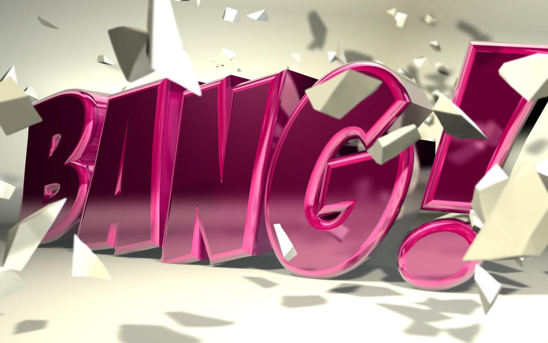
"BANG!" Deviantart By: b4ddy http://www.deviantart.com/art/C4D-quot-Bang-quot-Typography-152271000
This image is an example of Loud Typography because the word BANG! is as large as the paper it is printed on. It screams at you, when you first look at it your eyes are caught by the capital letters, the eye popping catch of the purple color and the pieces of debris scattered throughout the picture.
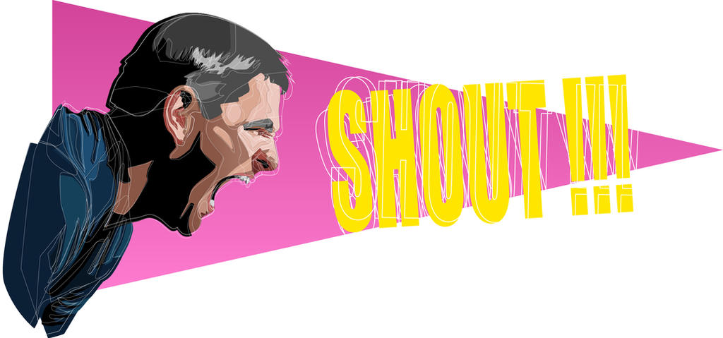 |
| "SHOUT!!" Deviantart By: Mestav http://www.deviantart.com/art/SHOUT-353322777 |
 |
| "LOUD AND PROUD" By: Aruetter Deviantart http://www.deviantart.com/?q=loud+typography&offset=120 The mega-phone is a device to make what you say louder and for more people to hear you. She is yelling in the mega-phone "LOUD AND PROUD" and the actual words are large, which seems like they are screaming them too you without actually hearing the words. |
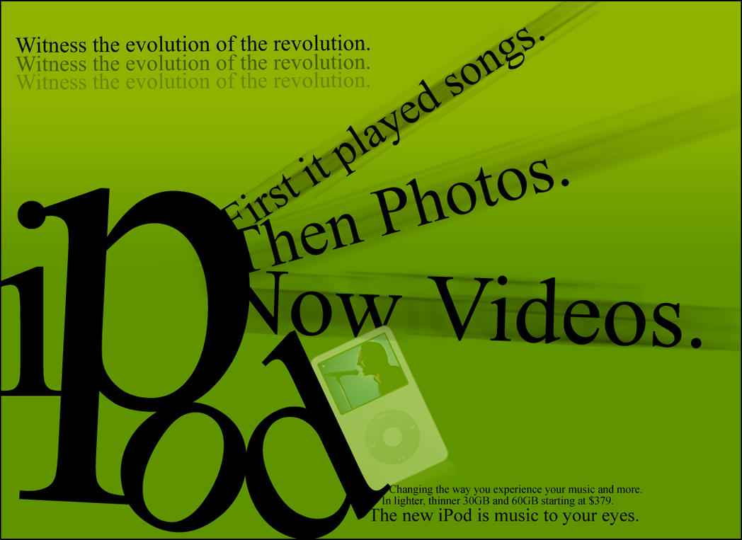 |
| "IPOD" Deviantart By: curicalbiitch http://www.deviantart.com/art/ipod-typography-29944393 Its an advertisement for IPods, the "IPod" is the biggest word on the page making it the first part of the advertisement you see. It screams at you, buy an Ipod! It's getting bigger and better with every new edition that is coming out. |
No comments:
Post a Comment