 |
| When you look
at this picture the font style really grabs your attention due to its
authenticity. The classic and timeless look is a real eye catcher. by João Franco |
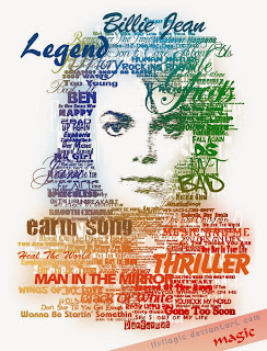
We found this piece to be very unique and artistic due to
the different varieties of font sizes, styles and colours . Also, the way he interpreted the words to act
as hair in this piece. We like how it
captured Michael career and life in words and made it part of the image.
by ~llvllagic
This image is different in the way that it gives you the illusion that it is on a projection screen due to the bright light in the center of the image. Allowing the words in the center to be preserved as much clearer than the words on the outskirts. That is why this image caught our eye because of its uniqueness and style of writing.


No comments:
Post a Comment