Metaphoric Lettering, which is the using of different font styles, is said to have begun around the 1840 by Vincent Figgins. It was when the term rustic was founded, Figgins also started Tuscan letter forms around 1815.
- Metaphoric letters help add dimensions to a page, image or advisement.
“Broken up into 5 parts trying/to look/good/limits/my life and displayed in sequence as typographic billboards, these phrases work like a sentimental greeting card left in a park north of Paris.”
Design: Sagmeister Inc., New York
Art Direction: Stefan Sagmeister
Design: Stefan Sagmeister, Matthias Ernstberger
Photo: Matthias Ernstberger
Art Direction: Stefan Sagmeister
Design: Stefan Sagmeister, Matthias Ernstberger
Photo: Matthias Ernstberger
- Visual puns are used to enliven the printed word and add dimension to a page.
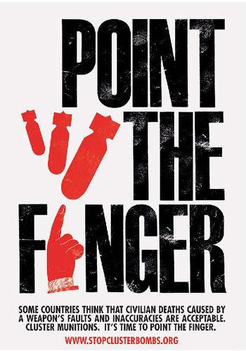
This image is stating that civilians believe it’s time for the deaths caused by a weapon’s fault and inaccuracies, for someone to take the blame.
Point the Finger (c. 2011)
A poster designed for “Beat the Drum to Ban Cluster Bombs.”
-The accusatory finger indicates those nations who have not signed the Convention on Cluster Munitions.
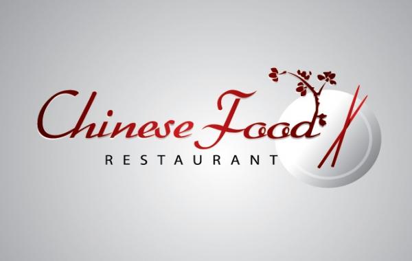
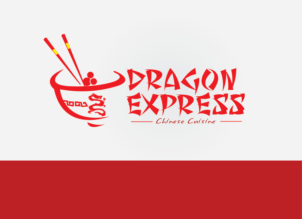
Metaphoric letter can also be see in our everyday life such as chopstick’s being place within the wording in a Chinese restaurant’s name.
No comments:
Post a Comment